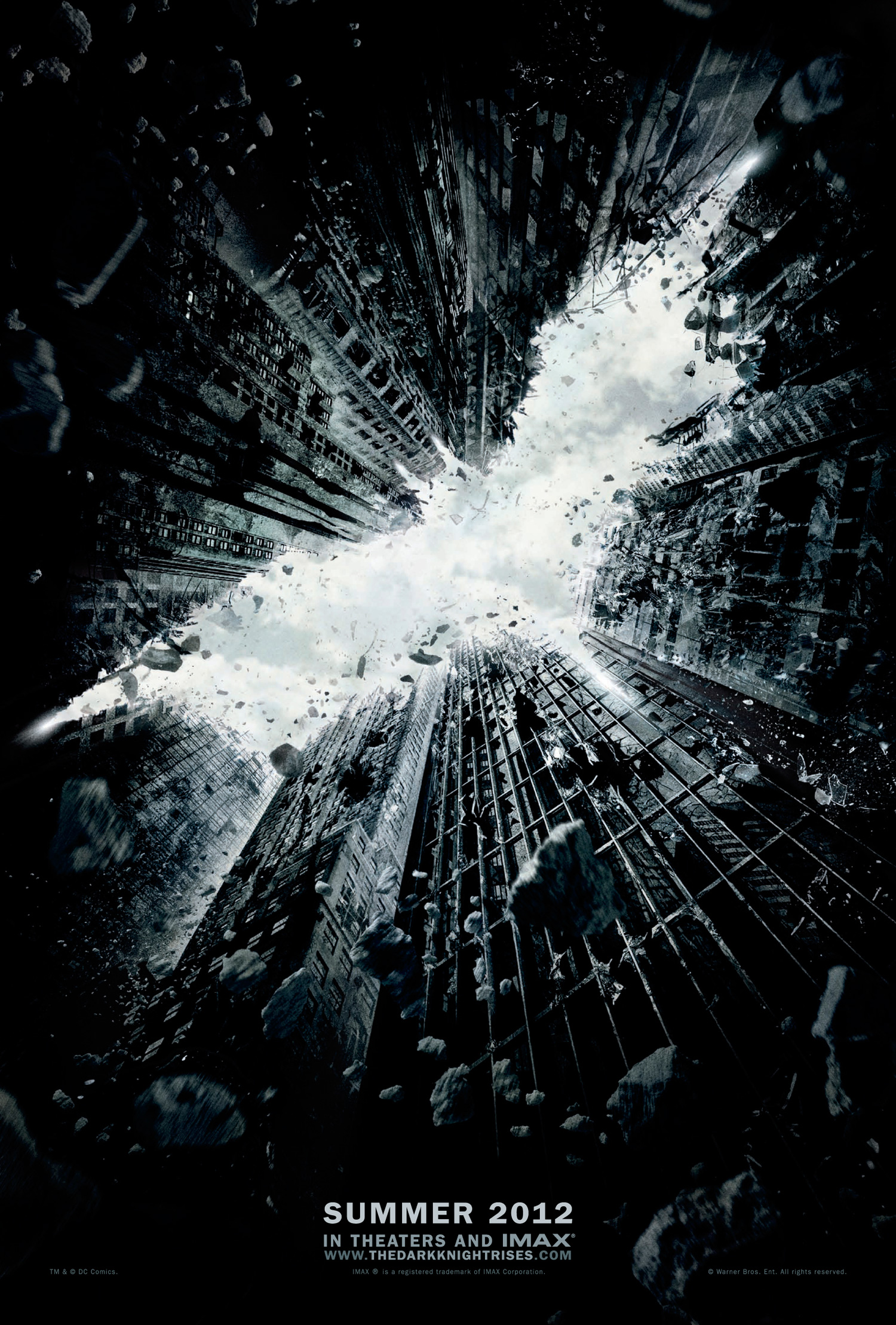
YES. This is how you make a teaser poster. To realize just how awesome this teaser poster is, I want you to head back to X-Men First Class’ teaser posters. Regardless of whether or not you liked that movie, I think it’s safe to say we all thought the marketing campaign blew. Rather than something obvious, like Batman with a “3” behind him… or maybe Bruce Wayne with a curly mustache twisting the end (because he’s the bad guy now). They’ve gone with this subtle dramatic way to tease us.
Is that Gotham city falling down around Batman? Or is it more symbolic, in that Bruce’s world is crashing around him. Maybe it’s a way of showing him conquering Gotham, and that’s why it’s crumbling. High res version below, and comments below that. Let us know what you think!
Via: Bleeding Cool
