The Dark Crystal is a film that has embedded itself into our consciousness, ever so subtly, since its release in 1982. It was technically groundbreaking in regard to animatronics and puppetry, and despite initial
mixed reviews, is looked upon favorably. And now in the final arc of The Dark Crystal, Kensho learns the extent of Thurma’s lie surrounding the mythic Pool of Tears. The Power of the Dark Crystal #9 (Archaia), written by Simon Spurrier (X-MEN) and Phillip Kennedy Johnson (Aquaman), art by sisters Kelly and Nichole Matthews, letters by Jim Campbell, cover art by Mark Buckingham, turns up the heat.
As first impressions go, the front cover hits a home run. The art by Buckingham holds true to that mystical quality that was such an integral part of the feature film. The quality of the art on the cover is one of the high points of The Dark Crystal. The detail in the Gelfling robe is exceptional. The use of grays, whites, and yellows to create the wrinkles is ingenious, yet it’s highly efficient. This goes for the detail around the collar as well as the hair and skin membrane of the creatures. The quality of the cover is good enough for a novel and is some of the best art found in this particular comic book.
Unfortunately, I don’t have much to say about the writing. I found it rather bland and uninteresting. It’s been awhile since I’ve seen The Dark Crystal, so I’m not sure if it’s intentionally trying to capture the simplicity of a film geared towards a younger audience, but I feel like more could’ve been done to convey emotion out of Kensho, Thurma and even the Skeksis. On the other hand, the dialogue captures Aughera’s voice to a T. When reading her exchange, it is nearly impossible not hear her high pitched screech in your head.
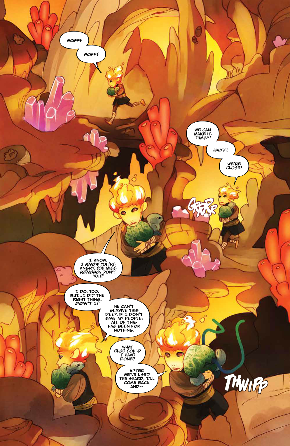
Likewise goes for the interior art. The illustrations were adequate enough to capture the likeness of the Gelflings. The limited range of emotion expressed by Kensho is in no way a misstep by Matthews; instead, it maintains a consistency that originated with the feature films use of puppetry. The writing had the potential of carrying the emotional load but was unsuccessful in doing so.The grotesqueness of the Skeksis is dialed down quite a bit for the comic in comparison to the film’s version, which is ironic considering the original movie was geared towards a younger audience. Whether or not that’s due to an artistic interpretation or a conscious stylized portrayal is unclear, but judging by some of Matthews’ previous work I’d say it’s the prior.

My most significant bit of contention is targeted at the monochrome color pallet which made some panels appear as if I was looking through a pair of tinted glasses. Entire pages of browns/yellows/oranges overpowered anything that was in the foreground to the point where depth perception became an issue. One has to wonder if the budget didn’t allow for more than six colors for the entire issue.
Overall, I’d reserve The Power of The Dark Crystal #9 for the biggest fans of the franchise, as there isn’t much here for the casual fan to appreciate, save for the cover art. The Power of The Dark Crystal #9 is available now.
Eric Onkenhout
@EricOnkenhout
@WritingEric