The Tomorrows Issue #2 Review
The second issue of Curt Pires’ “The Tomorrows” is a mess. Despite the big ideas and ambition that may be behind it, its execution fails in almost every category. The problems are so frequent and so glaring, it’s hard to know where to start.
For anyone who picks up the second issue of “The Tomorrows” expecting it to continue the story that began in the premiere, it doesn’t. The near future, urban sprawl New York has been left behind for the anarchist state of “New Rio.” Instead of continuing the story of the titular heroes jump-starting a revolution, or continuing along the plot threads that were placed in the premiere, Pires opted to drop the characters in a new setting to tell a story that has nothing to do with the one that started the series.
For anyone just joining the series, don’t worry if you’re confused, everyone else is too.
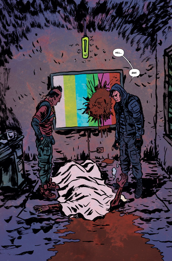
One of the Tomorrows has been murdered. It’s not any of the characters that readers were introduced to in issue #1. It’s a completely new character that we’ve never seen before. So his death, though brutal, passes with little care or interest for the reader. His name is Jacosta—something I had to go back and look up because it’s only ever mentioned once and—to the story’s detriment, doesn’t even matter that much. He’s a body. A dead body. That’s it.

It’s a setup like this that lends itself to another glaring problem with the series. Pires is apt to handhold the readers and tell them everything that’s happening rather than showing it to them. It starts with the unnecessary info-dump that opens the issue, but only continues throughout.
Worse than the telling, though, is the fact that the story or characters often contradict what we’re being told. Take, for example the character of Cladius. He’s supposed to be very upset about Jacosta’s death, despite his lackluster “Well, shit” response when he sees the body of his dead friend. It’s a moment that rings incredibly false because it doesn’t only contradict what we’re told the character is actually feeling, it seems like Pires simply threw it in because it sounded cool rather than being motivated by the character. It’s a scene that leaves the reader with a narrative at war with itself and only exacerbates the problem of underdeveloped protagonists.
The entire “murder mystery” plot is a clichéd paint-by-number story, but calling it a “mystery” in a misnomer. There really isn’t a mystery involved. The plot hangs on the characters returning to the scene of Jacosta’s death and finding a clue that they over looked. A huge clue. A monumental clue. When they find it, one of the characters even says “I don’t know how we missed it,” and neither do I because they spot it within seconds of entering the room. There’s no conflict, it wasn’t earned, it just happened because that’s what needed to happen to move the plot forward.
The story moves at a break-neck pace. Nothing is developed, least of all the characters, because Pires is so busy shuffling readers along from one page to the other. The only time the story seems to slow down is for an awkward sequence featuring two of the characters from the first issue who play absolutely no part here at all.
The dialogue is limited throughout, but when the characters do get the chance to talk it’s usually in clichés. I cringed throughout while characters spouted lines like “Do you think it’s death I’m afraid of? Death? I welcome it,” or “You’re so blind you don’t even see it.” And when they’re not conversing in clichés, it only gets worse. The characters speak like people too cool for their own good, but perhaps it’s a deliberate choice for a group that self-identify as “artistic terrorists.”
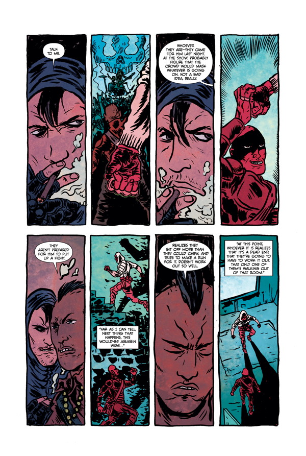
The story definitely isn’t helped by a change in artist. The art in issue #1 was rough, but this issue’s art in downright messy. This time around, Alexis Ziritt has taken over for Jason Copland. Bafflingly, Dark Horse thought it was a good idea not only to switch up the artistic team this early on in the series’ initial run, but it’s a trend that’s going to continue with a new illustrator every issue.
I’d like to think that Curt Pires is playing at a longer game, but I can’t be certai
Perhaps it’ll later prove to be a benefit as Ziritt’s art wasn’t right for this property at all. The character work makes the figures almost indistinguishable from one another, especially in the action sequences that comprise the majority of this issue. The figure work is stiff and lifeless. There’s no movement in the characters; even in those action scenes they look rigid and staged rather than characters that inhabit a world.

The use of space seems more like a waste than a choice. Often the background of a scene is left blank, replaced by a bright wash of bold color. I will say that it was at least a smart choice on Adam Metcalfe’s part to go with the bolder color scheme, not only to set the tone of New Rio, but also to avoid the blue/gray wash of other dystopian futures. Because of loose art, though, the panels aren’t captivating and often look like they were dropped out of the opening credits of an early-90’s after-school special.
I’d like to think that Curt Pires is playing at a longer game, but I can’t be certain. Of the two issues so far, they’ve both been complete arcs crammed into less than thirty pages. There’s little development, no conflict, and no true through line to follow from one issue to the next. With the constant change in artist I’m left wondering if this is the plan for the series: vignettes featuring recurring characters that speak in hyper-stylized vernacular drifting from one panel to the next. If that’s Pires’ vision of the future, it’s a bleak one, indeed.
4/10