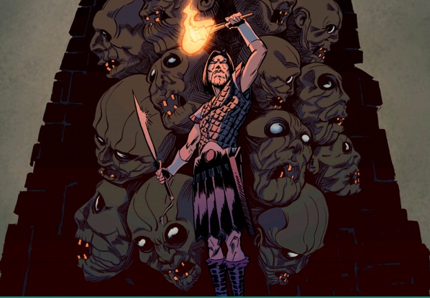
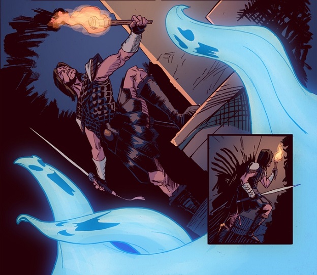
Whilst browsing the latest Kickstarter campaigns listed under comics I found a gem. The book is called “The Adversary” and the writer was happy enough to give me an early peek at the book. I’m a backer and I can plainly tell you I am because I want to get my hands on a paper copy of this wonderful story. The art is what initially drew me in. It isn’t Mike Mignola but it has the feel of art you’d find in the pages of a Horror comic from Dark Horse.
The artist, Tony Gregori, is paired wonderfully with the colorist Jasen Smith. Together, they’ve created the art that blurs the line between indie and corporate comics. Sure, the first reference that came to my mind was the wonderfully talented Mignola, but that’s just a reference point. Looking deeper, the book is wholly unique. The artists get close to a familiar feel but their artistic style shines through and becomes a new reference point for future indie creators. If you’re creating your own comic book you’ll be doing yourself a favor to learn from the successes in their pages.
“The Adversary” doesn’t disappoint the indie promise of unique story telling. David Crispino has promised a One-Shot comic book and he delivers. The story begins with the hero Mikhail exploring a temple. We’re instantly drawn to the character via a well done use of tropes and artistic design. The use of captions, that are full of an almost paper-back like amount of detail, set the stage quickly. It is done deftly and without sacrificing a rich and engaging tale for readers. David accomplishes what few mainstream comics do lately, and that is tell a successful story in one issue.

David and his artist collaborators couldn’t have done such a successful job without their letterer though and I would be remise if I didn’t mention the wonderful work Rachel Deering brings to the book. The lettering is well done and elevates the book. I’ve read many indie comics with colorful or unique lettering that may be a bold artistic choice but just ends up distracting from the story. Successful lettering should only be noticed because it blends into the background, is easy to read and follow, and doesn’t cover up the art in any obvious places.
Indie books have always been a love of mine. Creators, with nothing more than grit and some hard work, put in their all to tell their own story. Sometimes the quality reveals the indie work but at other times the difference between the independent story and the large publisher one is very small. Because this happens on occasion, I try my best to keep my eyes peeled for a quality story everyone should be on the lookout for. After all, how else will everyone hear about an independent book unless someone has spread the word?
If you think “The Adversary” could be up your alley, feel free to look up the book and more art previews on Kickstarter. In the meantime, if you have an indie book you’d like to take a look at, please drop me a line on Twitter @MarkAvo.

