Zendobot is off having some sort of adventure this week so he asked me to step in and take the helm of the great ship “Five and Three,” may God have mercy on his soul. This week I’ve picked my five favorite covers and three favorite panels to create “Five and Three.” I’ll talk about why I picked these particular covers and panels. As always we welcome hecklers and trend setters alike. If you want to tell me that I suck or maybe start the hashtag #BringBackZendoBot, you can find me at @CassidyWard on Twitter. Zendobot can be found at @MarkAvo on Twitter and @TheMarkAvo on the Instagrams, so you can tell him how much he is missed.
Without further ado, my picks for this week, starting with the covers.
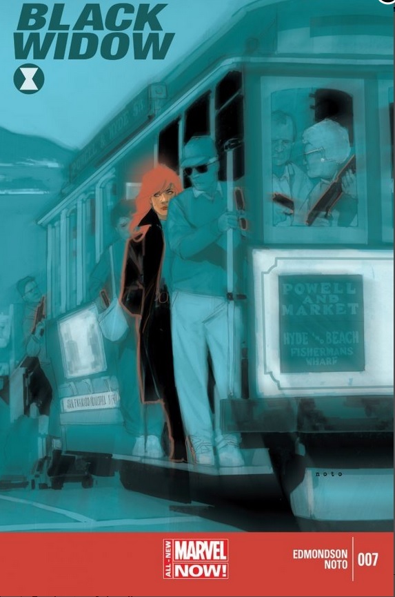
The first cover I picked was “Black Widow” #7. I like this cover because of the contrast between Widow and her surroundings. This was the first thing that caught my eye, upon further inspection I noticed that everyone is holding guns and they stick out in the same way the titular character does. For some reason, to me, it seems to represent PTSD, or the notion that one can see danger wherever they are, even if it’s not justified. I could be off the mark, but that’s what struck me when looking at it.

The second cover this week is “Green Arrow: Broken” #32. This cover is appealing for both the way it obviously represents and expresses the title and theme of the story, but also it’s complexity, the more I look at the shattered pieces of the hero, the more I see. It is visually interesting in a way I can’t quite explain. Though, with art, a concrete explanation isn’t necessary. I may not know why, but I know what I like.
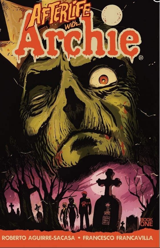
This cover for “Afterlife with Archie” was an easy pick. Who doesn’t want to see the wholesome crew of Riverdale get sucked into some dark macabre situations. If you don’t think that’s the coolest idea since the “Jetsons” met the “Flinstones” then just get out of my face.
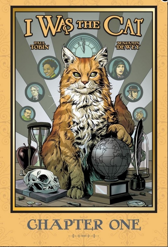
Next up is “I Was the Cat” chapter one. In truth I don’t know anything about this book but the cover captured my imagination. I know one thing for certain and it’s that I need to know more about this cat. He’s got a globe and a quill, and for some reason the skull of another cat, which in the context of a feline protagonist is pretty heavy.
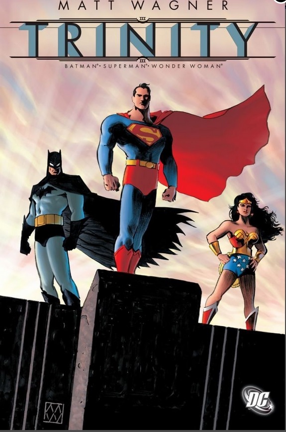
I chose this cover of “Trinity” because it feels timeless. It expresses the larger than life quality of these characters beautifully. It showcases both the power and the grace that these characters embody. You feel both secure and intimidated at once. Now it’s time to move on to my favorite panels this week.
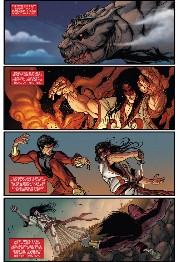
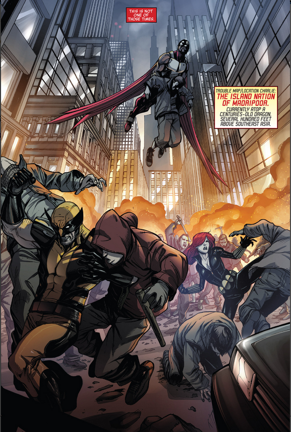
These panels are pulled from “Avengers World” #7. I chose these panels for a couple of reasons. Firstly, the initial panel is fantastic, the city atop the monster is reminiscent of Terry Pratchett’s “Disc World.” Secondly, I was impressed with the set up of the initial page, and the payoff of the full page spread that follows.
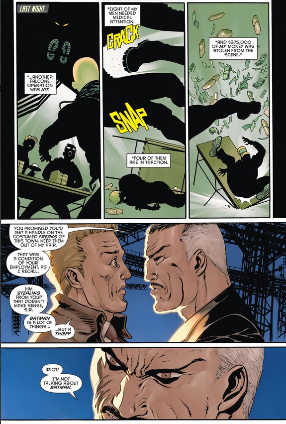
Next up is “Batman Eternal” #9. I liked these panels because they successfully flipped my expectations, of course Falcone is calling in his crooked cops to stop the Batman…. wait, what?
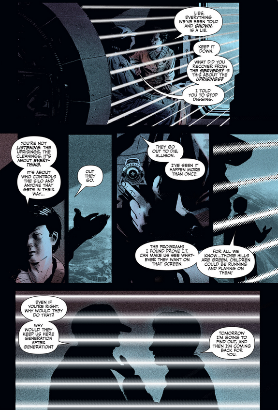
Last but certainly not least, I give you a page from “Wool” issue #1. I chose this page because it did exactly what a good comic book is supposed to do, it left me needing to know more. In a world where we are fed a constant stream of pseudo-news from our major media outlets, I can relate to characters that ask the question, “What if it’s all a big lie? What will we see if we look behind the curtain?”
I hope you enjoyed this week’s “Five and Three.” If not, you have my sincerest apologies, we’ll be back next week with your regularly scheduled host.
Cheers.